Notifing Users of Important Needs with an Account Status Dashboard
Background:
After the acquisition of Time Warner Cable, Charter Communications became the second largest cable provider in the United States and, under the brand Spectrum, providing services to 26 million people across 41 states. This merger required the consolidation of customer accounts that could be accessed from a single web portal. To enable customers to access their account online the information needed to be consolidated and formatted consistently. This consolidation revealed missing and incorrect information that could limit the abilities of those customers to access, change, and use the features of their account.
Initial Request:
The product owners first approached my team with a request to create design assets for a series of modals prompting users to update their information upon login.Discovery:
In our discovery work we identified a number of potential experience issues with this approach.
- The user's intended task would be interrupted with an unexpected flow.
- The number of required updates could be higher than the average number of visits customers make to the portal preventing the account from ever being completely up-to-date.
- As a best practice, modals should be used as basic dialogs and avoid adding complex flows within them.
To resolve these issues I arranged a workshop with all stakeholders including product, design, and engineering to collectively define the core problem that needed to be solved.
Problem Statement:
Existing Spectrum customers need to be aware of, and have a way to change, any incomplete, incorrect, or outdated account information. This will help them effectively manage their account and avoid future problems that could be caused by inaccurate information.
By empathizing with the customers and defining a clear and agreed upon problem statement we could more accurately explore solutions.
User Flow

Initial Wire Frames

Hallway Testing
Tested 3 versions of the wireframes. 12 users were only shown one version and asked the following:
- What catches your attention on this page?
- What would you click to update your information?
- What would you be inclined or disinclined to add?
- What do you expect to happen once you add your information?
Takeaways
- Most users are comfortable providing the information that is asked for.
- Descriptive copy of each item could increase comfort.
- Create other pathways to enter the update form than just the “Update All” CTA.
- Show progress differently than with color progress indicator (red, yellow, green) since middle state of progress is unclear/frustrating to users.
Solution:
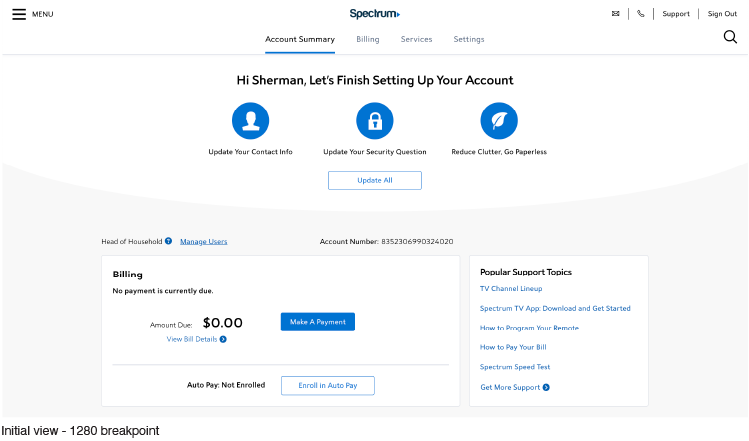
After testing initial concepts and wireframes high fidelity UI designs where composed, reviewed, and readied for development. These designs included an iconographic representation for each item the customer needed to address. These are presented into the view in a personalized and incorporated way, as a prominent but subtle alert, preventing the interruption of the completion of the users intended tasks. Each icon leads users to a specific micro flow, collecting the required information, storing the input, marking it as complete, and then moving on to the next item.
UI Designs


Creating Campaigns:
Each individual request to be displayed in the dashboard is called a campaign. Each campaign has a set of criteria that needs to be met, for example incorrect contact info is identified by a flag in the database indicating that a message was sent to the email address or phone number and failed. If the flag is present on a contact info record then the “Incorrect Contact Info” campaign should be displayed. Each of the campaigns has its own set of criteria to be met. On login the account is checked to determine what campaigns (if any) should be displayed. If none of the criteria required to display any of the campaigns is met, the account needs no further attention and the dashboard is not displayed at all.
Prototyping:
To completely explore how the interface would look and act in a more real life state, prototypes are built to help explore the responsive display and user interactions in live code. Interacting and observing a prototype allows designs to be examined more closely and also enables the most accurate interface and experience when testing.
Usability Testing:
Method: unmoderated test of code-based prototype. 24 participants - 12 Spectrum customers, 12 non-Spectrum customers.
Goals:
- To understand whether or not the call to update catches user attention.
- To see how well users understand what is being asked of them.
- To understand how users would interact with the notification.
- To understand user satisfaction with the notification.


User Testing Feedback
“This helps me, and it’s not like it's real personal information.”
“Depends on what’s being asked. If I feel it makes my life easier and my services better – I would do it.”
“I like seeing it. It makes me think you are on top of my account and it keeps me on top of it.”
“It’s simple, easy, and shows me what I need to do right away.”
 Back to Main Page